 Discuss a project
LEO
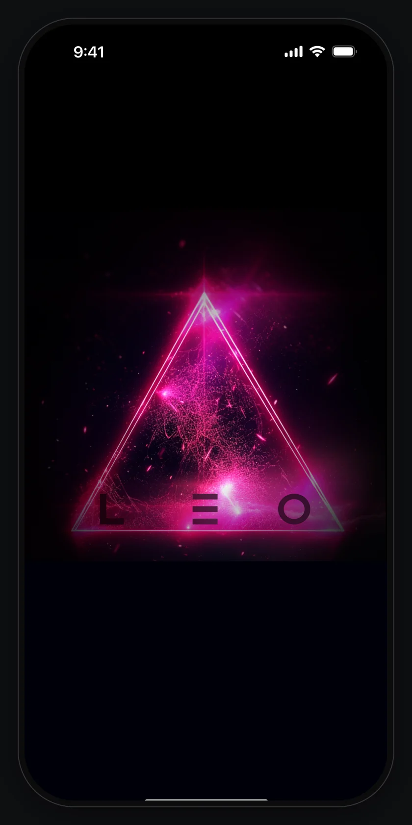
Product UI A meditation and affirmation app: the LEO sign, a dark interface and the screens from sign-up to the profile.
Overview
LEO is a mobile app for meditation, affirmations and yoga. The presentation sets out the main attributes of its brand: the typeface, the colours and images, and the app screens.
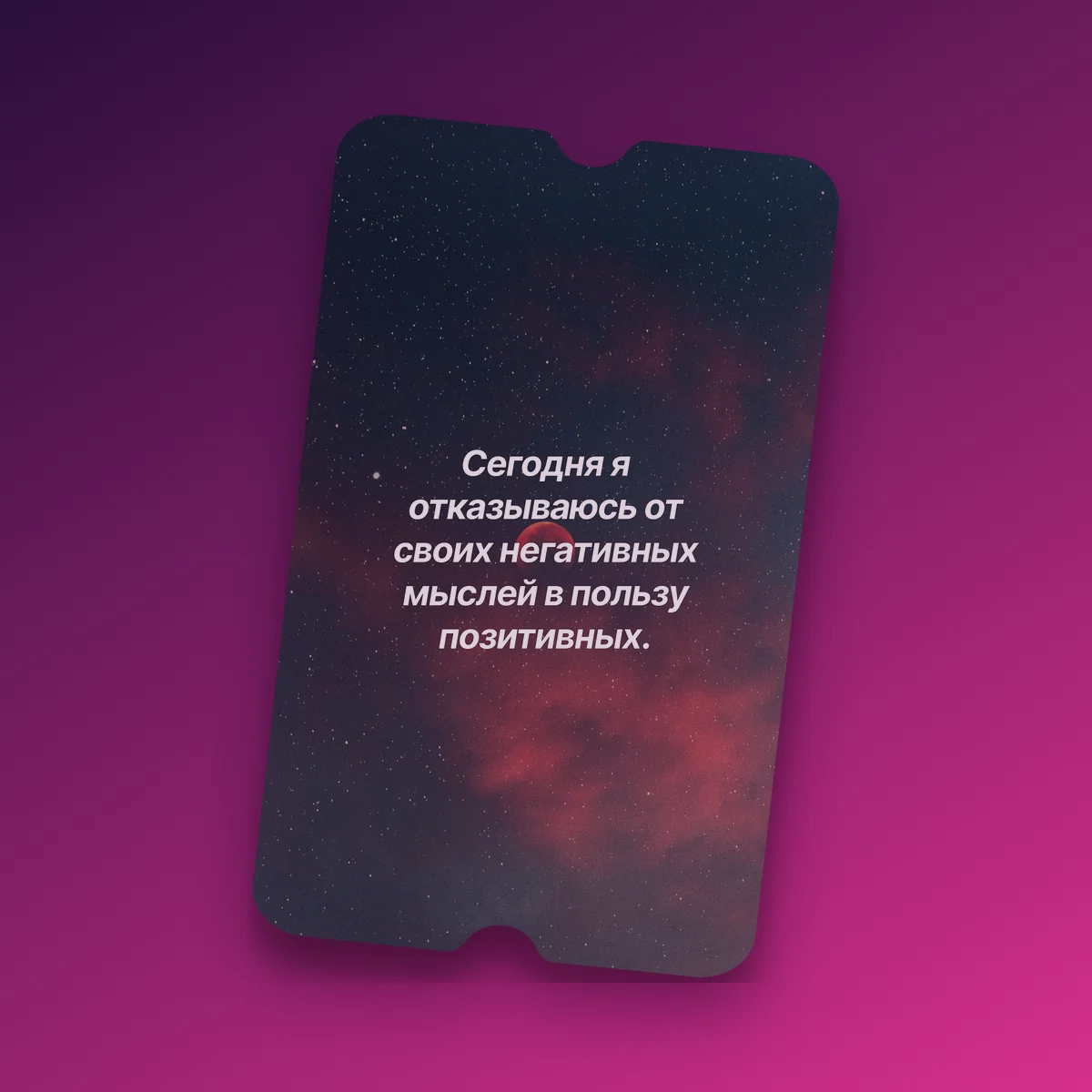
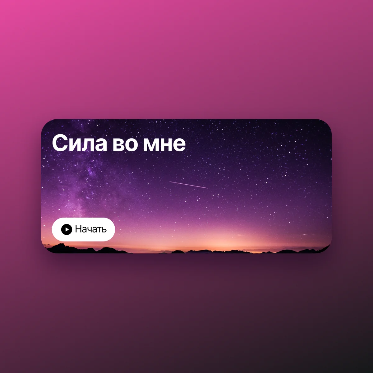
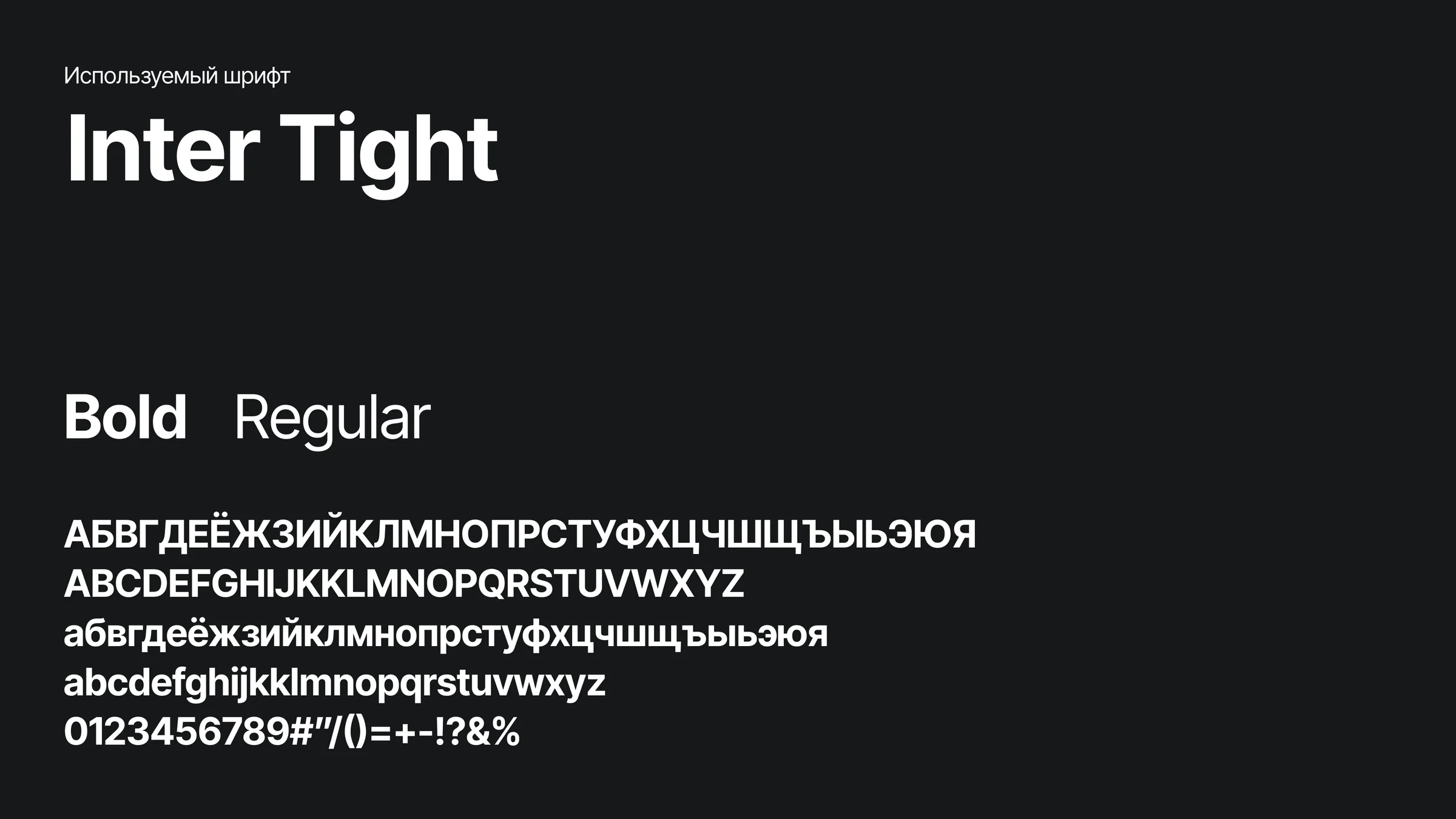
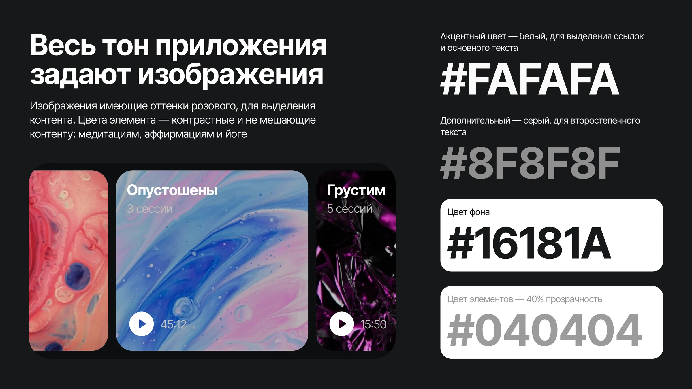
The whole tone of the app is set by images in shades of pink, which pick out the content. The interface colours are contrasting and stay out of the way of the meditations, affirmations and yoga: white #FAFAFA for links and the main text, grey #8F8F8F for secondary text, #16181A for the background. The typeface is Inter Tight, bold and regular.
Sign-up7
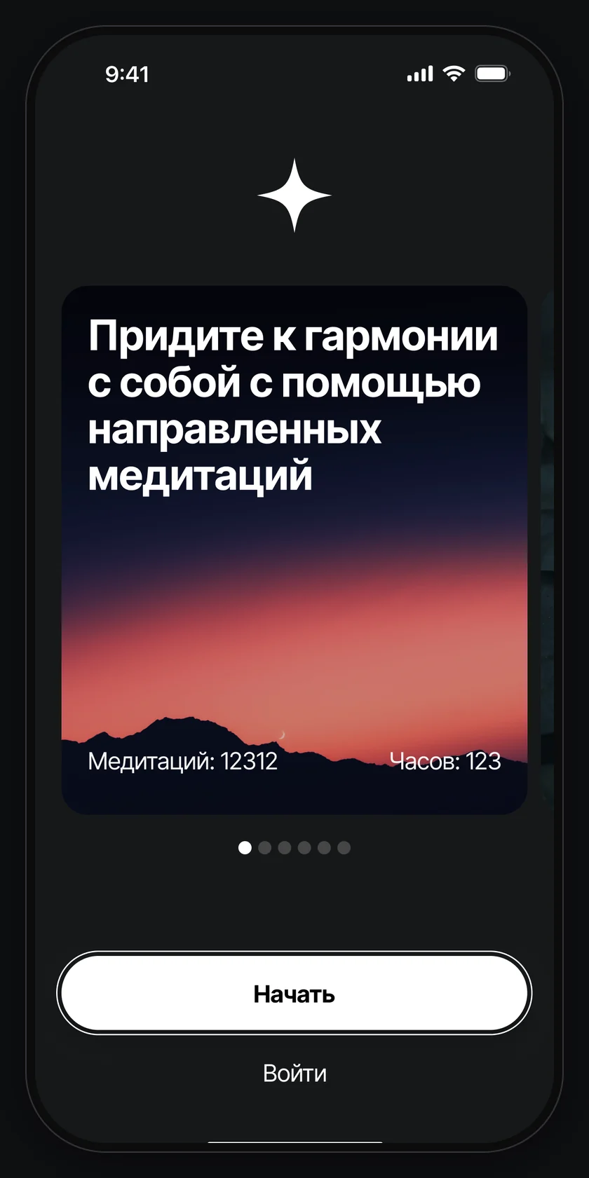
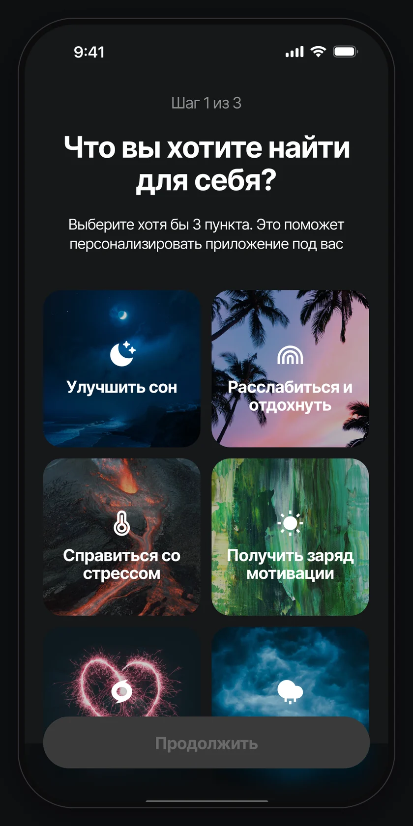
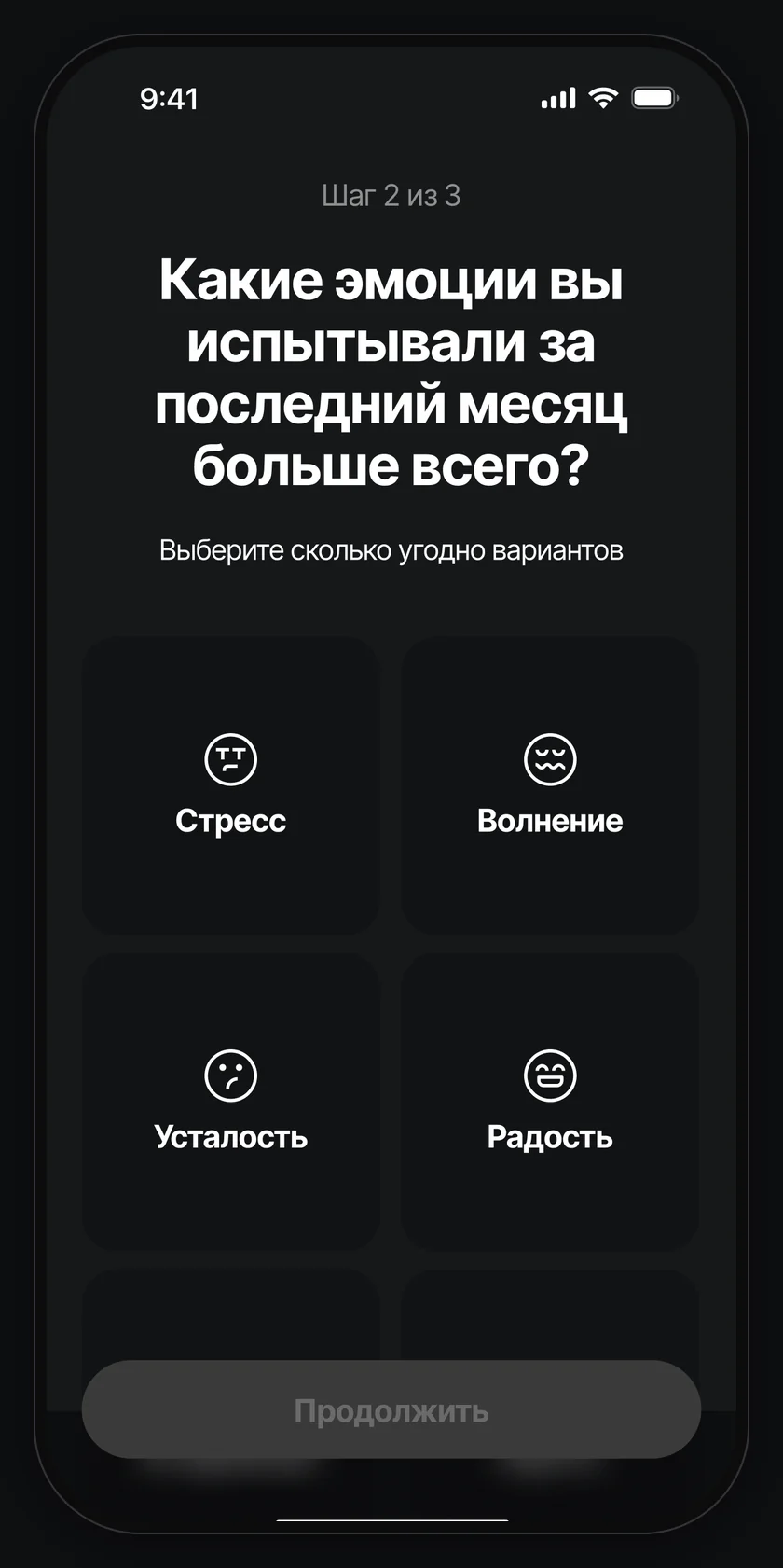
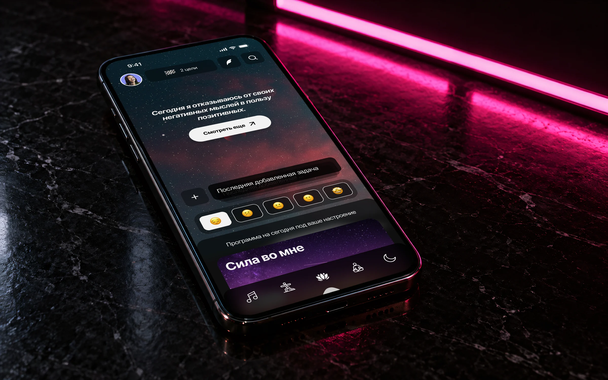
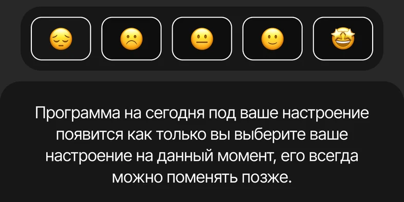
The mood of the day: five faces, and the programme for today appears once one is chosen; the mood can be changed later.
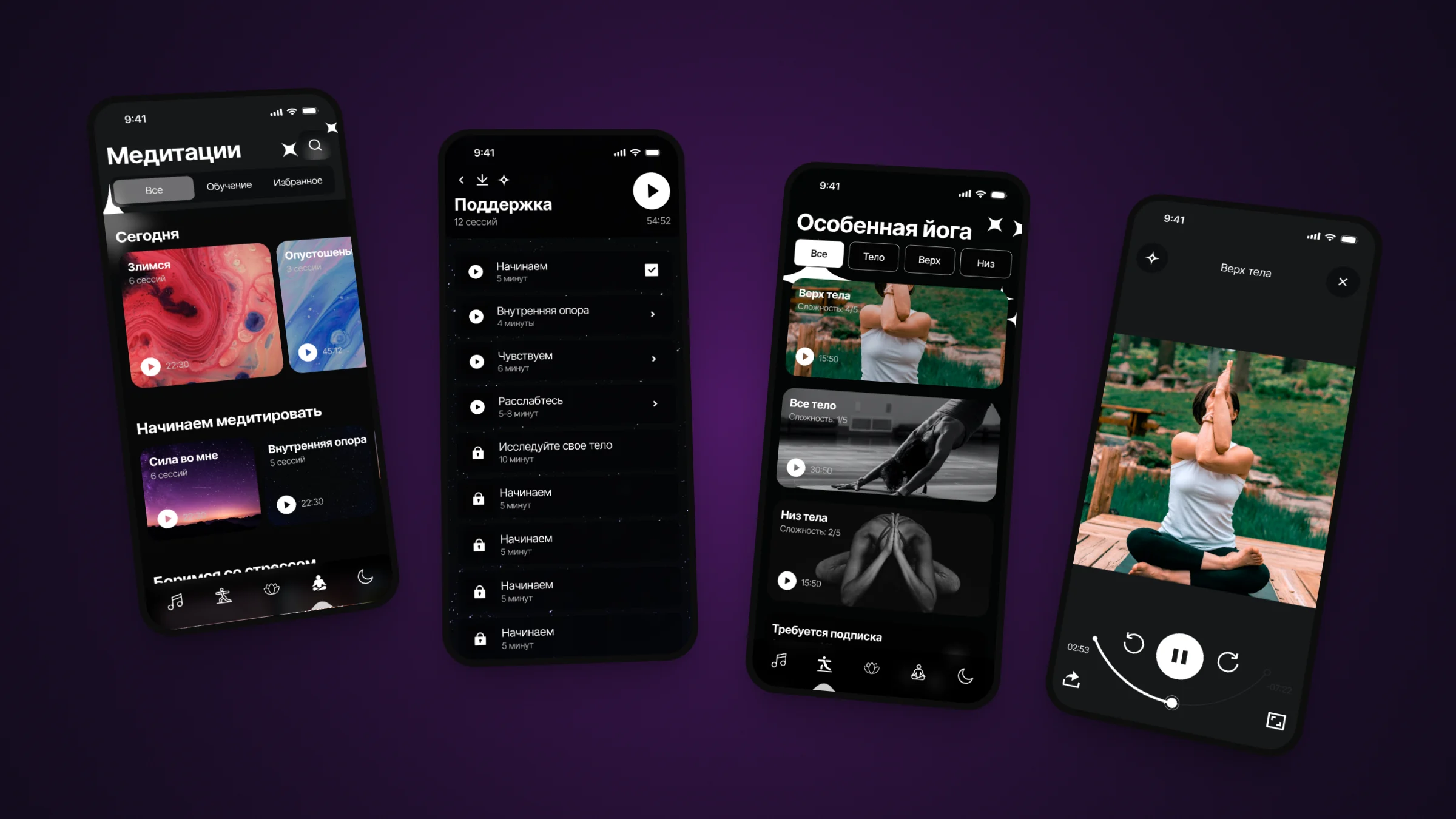
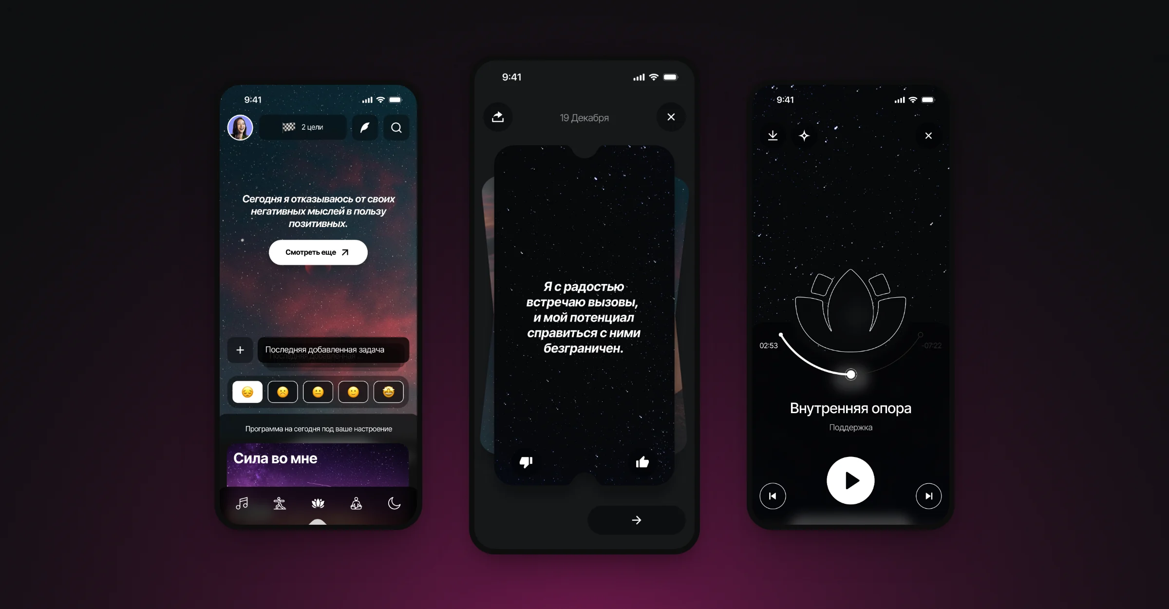
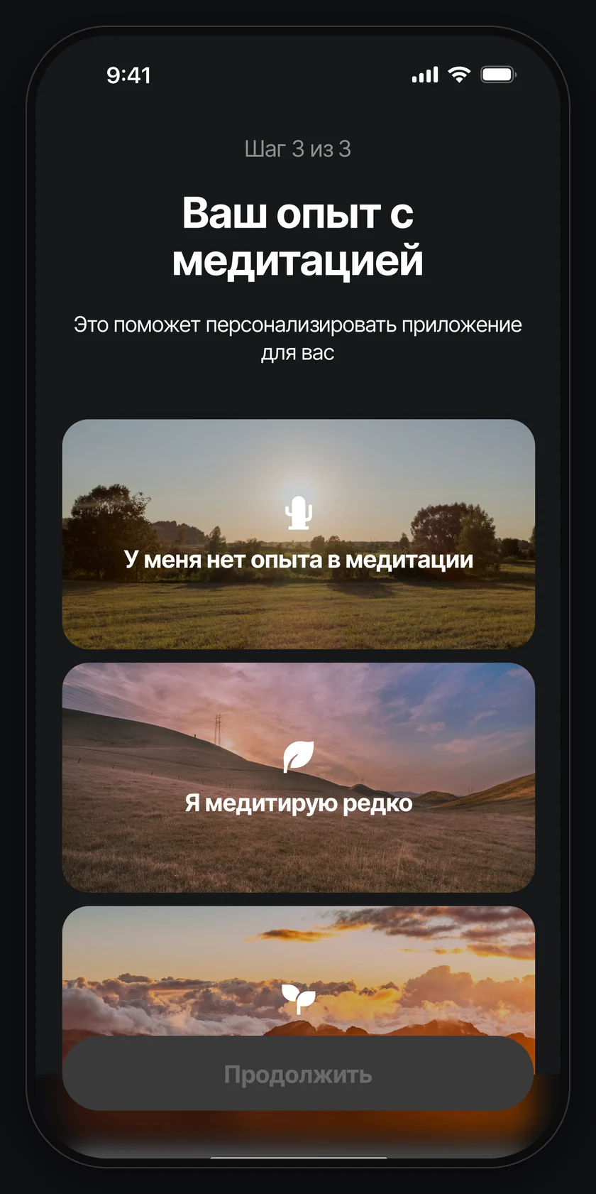
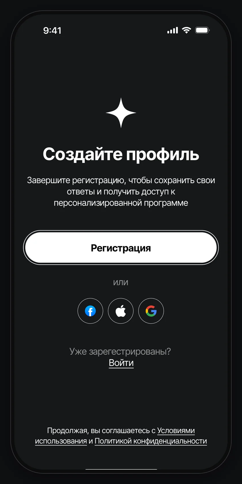
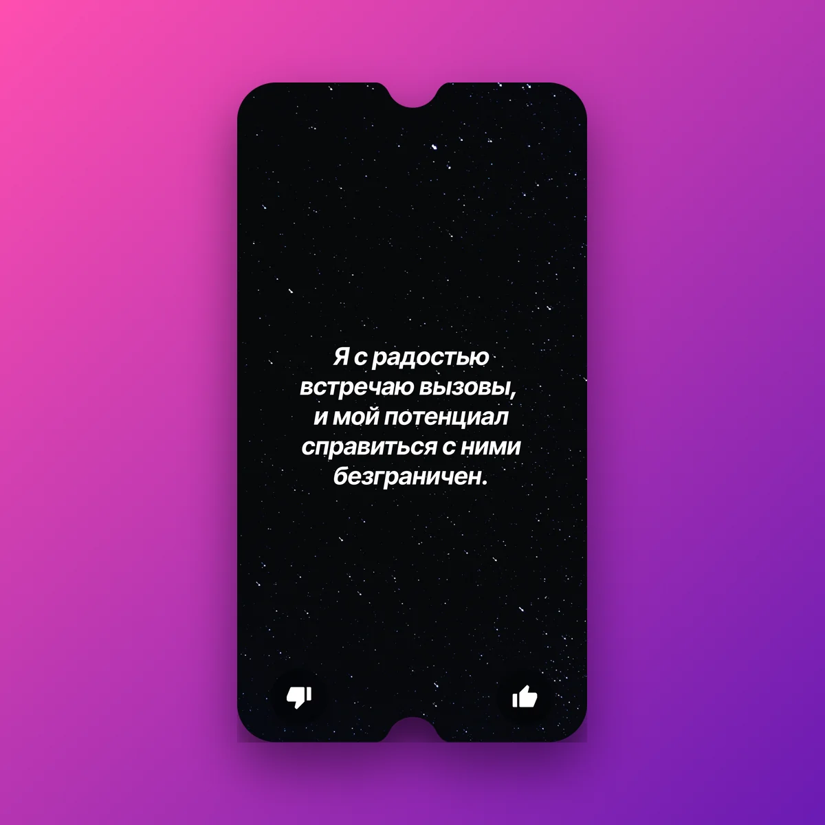
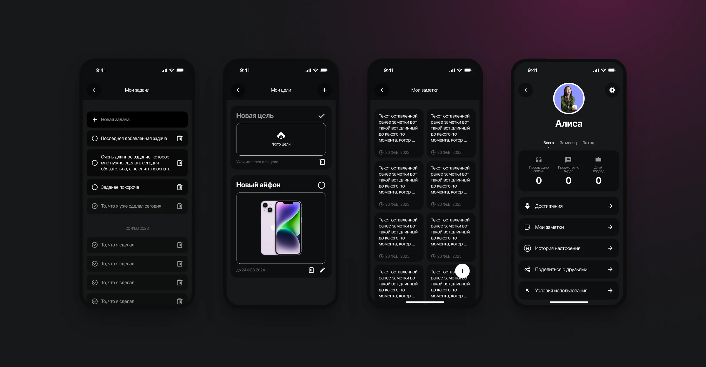
The screens run from sign-up and a short questionnaire to the home page with the mood of the day and affirmation cards, meditations and yoga with a player, tasks, goals and notes, and the user profile.
Credits
- Brand and app interface
- Jean Ivanov
 Next projectINKASProduct presentation